


New Olympic uniforms. How are they?
Written By: Ben Drury


Earlier this week we reached the 100 days to go until the Olympics mark. I don't if you have seen but some of the top brands have released their uniforms for this year's Olympics, and today I’m going to talk about them. Before I start I would just like to say that this is not a diss on the designers of these uniforms, but merely my opinion on them. With that out of the way, let’s get into it.
I would like to start my opinion by saying that this year’s set of uniforms across these brands is far from the best we have seen in a while. Considering this I will start with my least favorite of them all.
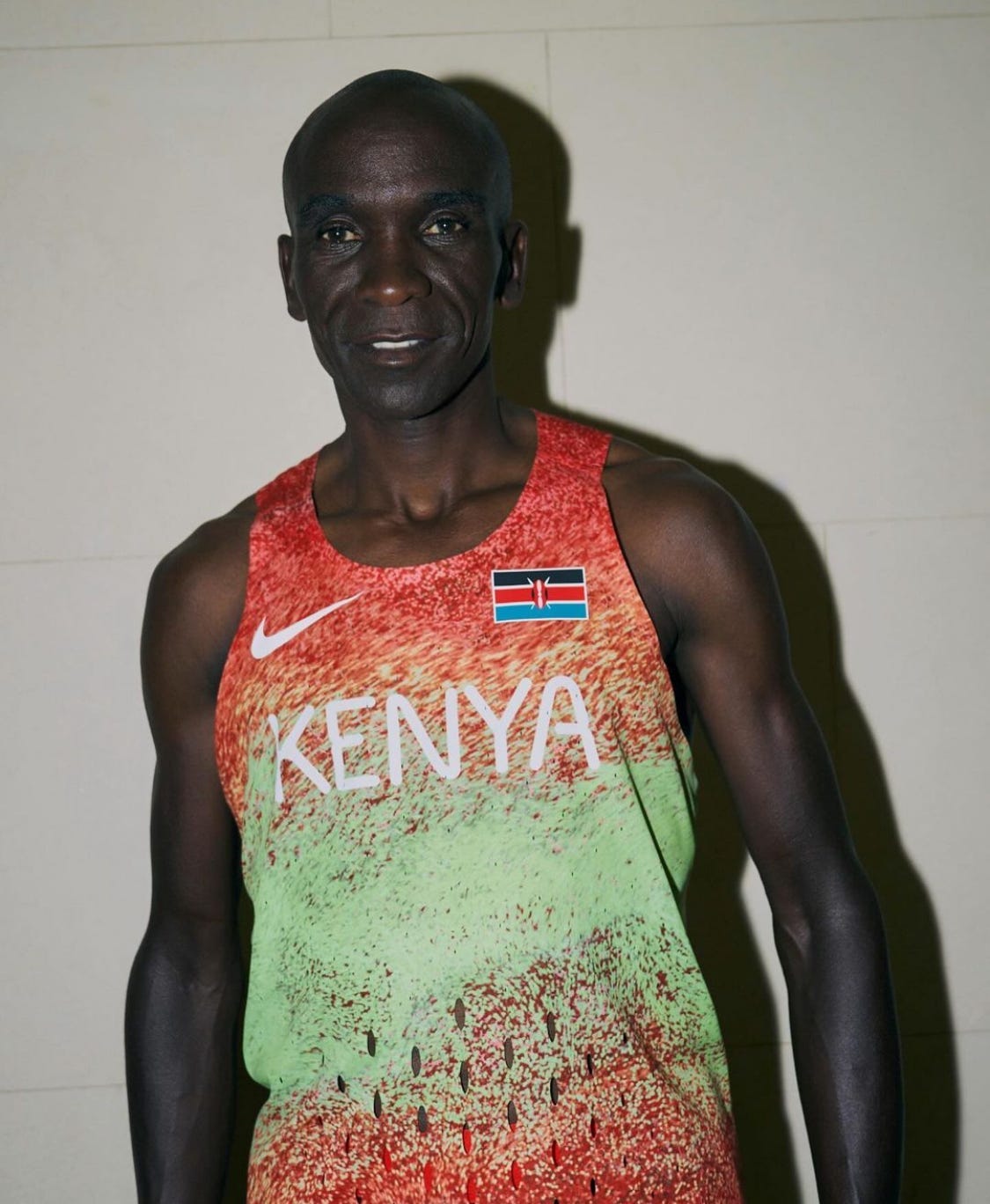
Nike as you most likely know is one of the biggest brands across the world, and is the biggest brand in the running world. With that being said, they unfortunately swung and missed when it came to making this year’s set of Olympic running uniforms. As you can see below, Eliud Kipchoge is wearing one of Kenya’s uniforms and I have two things to say about it. 1) The gradient is just not there and could be done way better, it doesn't have any of the right shades of the colors used in the flag and it just doesn’t look good. 2) Comic Sans, you have probably heard those words and if you haven’t just know that it is not a good font and the font that Nike chose looks too similar to it and for that, it doesn’t look good.
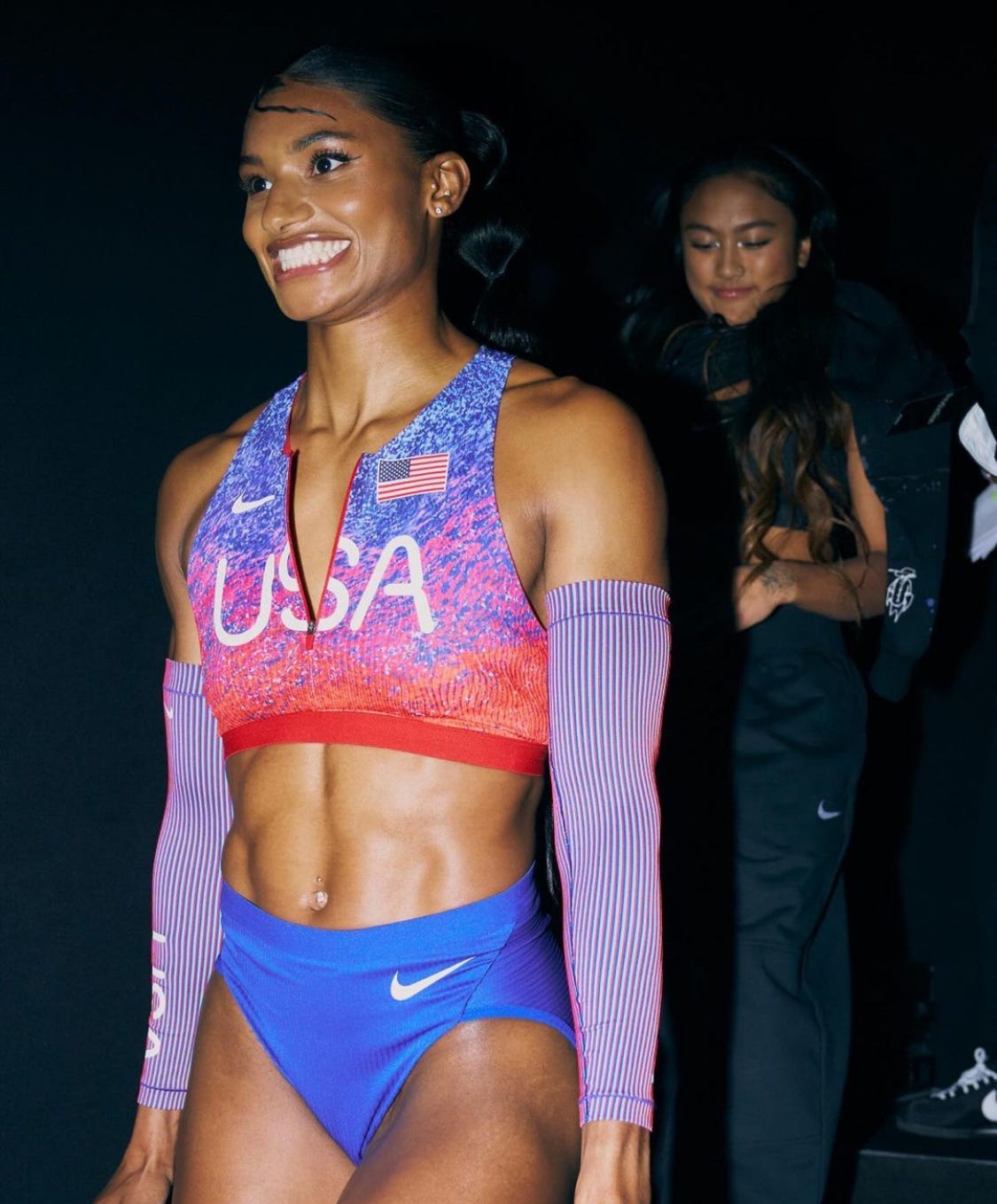
These two problems don’t stop here either, they continue with the U.S.’s uniform which I've put a picture of below. In the photo, Anna Cockrell, an American sprinter is pictured wearing the U.S. uniform, and as I mentioned the gradient doesn’t look good. None of the colors match the flag and not even the bottoms match the blue of the top, which is a major no for me. Then to top it off they have the same font, which once again doesn’t look good.
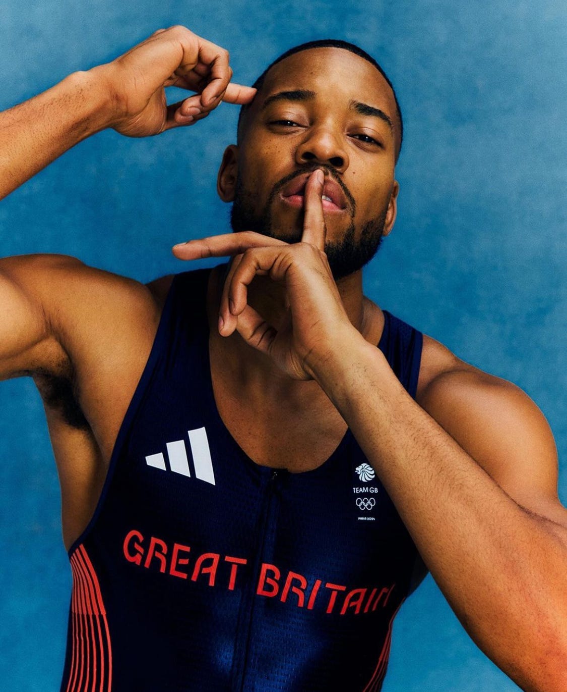
Next, is Adidas’ return to the making of Great Britain’s uniforms after being with Nike last year. Unlike the previous uniform I have no issues with this one and I honestly really like it. The designers on this one perfectly picked this navy blue and it does great showing off one of Great Britain’s main colors unlike the previous two. The font they used is also really good, it’s a cool font and an even better color choice which I like, and there’s nothing else to add. To be honest I’m glad Great Britain came back to using Adidas because Adidas did great with this one.
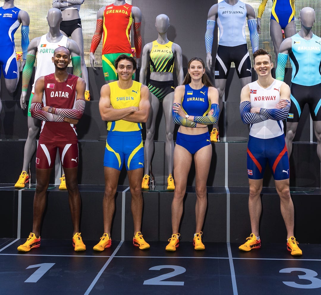
These next ones are certainly not as good as the last but they are still pretty good nonetheless. As you can see in the picture below, these new Puma Olympic uniforms will be worn by many countries including the few shown below. These uniforms are very simple and I like them a lot. Another thing I like about these is that they use their country’s colors in the uniform very well. However the good comes with the bad and unfortunately for these uniforms, the font is that problem. Like the Nike uniforms, Puma used a comic sans type font and my opinion hasn’t changed a bit.
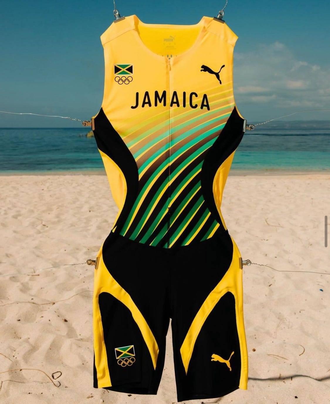
These four uniforms in the front row are ok but if you look past them you can see Jamaica’s new uniform which I’ve put a picture of below. This uniform unlike its other Puma counterparts is incredibly done. Whenever I think of Puma running I instantly think of Usain Bolt and Jamaica, brings back those memories. It keeps the classic Jamaica/Puma look much like the old uniforms that Usain Bolt wore when he broke all of his records and the design it uses just works so well. However, my opinion on this font changes for this uniform only. It looks good in this uniform and ties it together.
Overall these uniforms are pretty good, some are better than others but all in all, they are not bad. As I mentioned earlier it is now under 100 days to go until the Paris Olympics and until then Kicking For Home’s coverage of the Olympics will be ramping up, so stay tuned.